TOM: So Frieze is 20 years old. I first went in 2008, and it feels like a lifetime ago. We hadn’t yet met, I wasn’t even on Twitter. I had a job and a drink problem. Obviously we’ve changed a lot in that time but it feels like the fair has too and obviously the whole art market ecosystem which has been reorientated around fairs.
CRYSTAL: I think I must have first gone around the same time, but equally, it’s been years since I’ve been to Frieze—not since the mid-2010s. It feels different. Now, it’s gridded and homogenous, like a new town city plan, with white square boxes everywhere. I don’t know when exactly it changed into this more professional form, but the earlier fairs were definitely more chaotic and interesting. I didn’t love Simon Fujiwara’s Frozen installation from 2010, where he cut holes in the floor and made it like an ancient city had been discovered, but at least they were trying. Or the “Colosseum of the Consumed” by Grizedale Arts in 2012, you know with the food happenings and ridiculous events like the ginger curators dinner. Where did that chaotic energy go?
TOM: I mean, in 2009, Adam Chodzko released a wolf, a stag and a bunch of other animals into the tent in order to map alternative routes through the fair. The year before, I remember an artist who referred to themselves under the pseudonym “Norma Jeane” installed a row of individual, transparent booths for people to sit inside and smoke cigarettes.
CRYSTAL: Exactly. What happened to all that stuff?

TOM: Yup. To me it feels like, since the introduction of the outdoor sculpture section, anything potentially interesting or anti-commercial or just a bit silly has been shunted out in order for the fair itself to become a frictionless space of pure transaction. Frieze Projects, for example, has shifted from a series of curated interventions (initially by Polly Staple) to become just another bunch of stands but for smaller galleries.* So it now very much conforms to the spatial logics of the rest of the fair.
CRYSTAL: Having said that, for the first time probably ever, I was extremely in the mood to see an overwhelming amount of art in a pleasantly bland warehouse in a single day. I sometimes feel culture-starved in Edinburgh and for once, uncharacteristically, I was really looking forward to Frieze.
TOM: I had the same feeling last year tbh but then I didn’t go!
CRYSTAL: I think we decided that we wouldn’t try to dissect the entire fair, parsing out themes or trends or whatever, but that we would only talk about the work we liked, or at least weren’t entirely indifferent to.
TOM: So, where do you want to start?
CRYSTAL: I want to start with Danielle Mckinney at Marianne Boesky, which was by far and away my favourite work at the fair. I think I went back to look at it three times. The work puts me in mind of Miles Davis’s “Blue in Green”. Mckinney’s paintings are sensual, melodic and meticulously crafted, but there’s an incredible feeling of freedom about them, too.
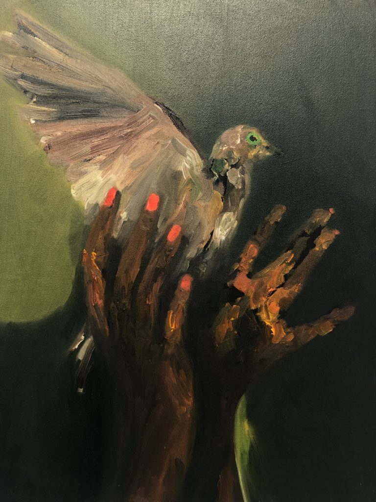
I kept having this uncanny feeling that I had seen the work before. Eventually I realised that I’d seen Mckinney’s solo show, Golden Hour, at Marianne Boesky in NYC last year. I loved the work when I saw it then, but that particular exhibition felt a little too overbalanced towards the suggestive side of Mckinney’s interest in the nude female form, so much so that I felt maybe a little perturbed by the degree of sexual objectification of women, despite the gorgeousness, and struggled to enjoy the show as much as I wanted to. I think this new work, or at least the edit shown at Frieze, better balances the sensuousness of Mckinney’s women partly by occasionally taking them out of domestic spaces or at least by presenting her women in domestic spaces doing things that aren’t smoking naked.
Mckinney puts paint down like she knows what she’s doing. Building up from a black canvas, a woman sits on the floor, her eyes closed. It mesmerises me, the way her green and blue dress emerges from brush strokes put together like puzzle pieces. Or, a Black nude form stretches back across a dark horse and the bold, gold shadow by the horse’s leg and the hot-orange-tipped toes bring everything to life. I’m absolutely crazy about Mckinney’s work and can’t wait to see more.
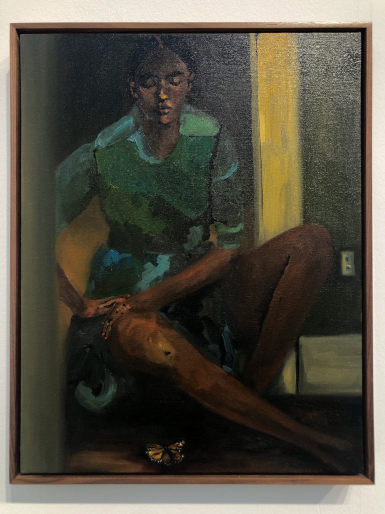
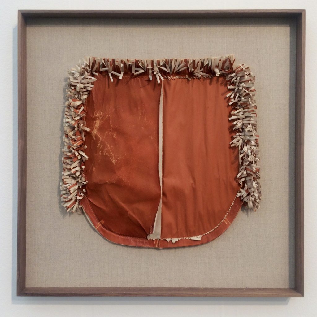
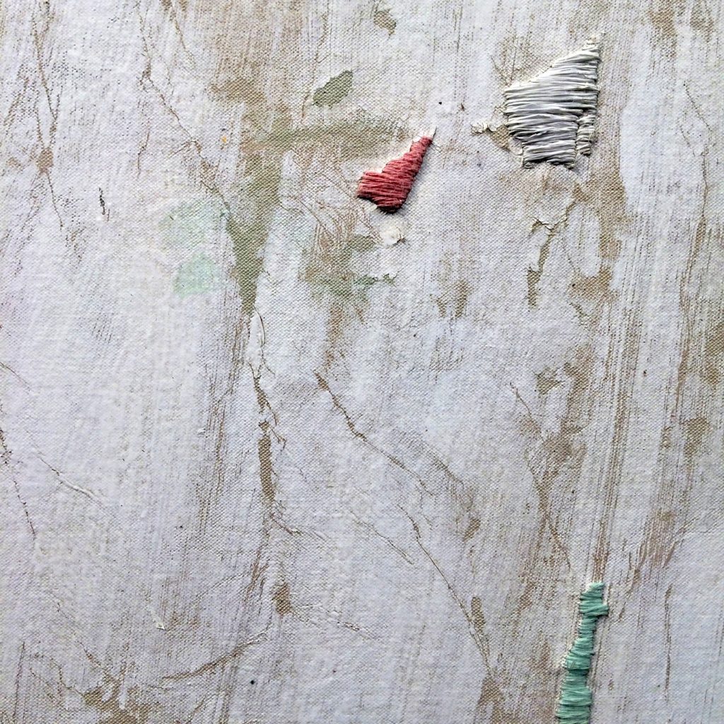
TOM: No question, her paintings are properly incredible. I’d love to see a big UK solo show for her soon. One painting I was really intrigued by was Asemahle Ntlonti’s Isikhumbuzo Selizwe at blank projects in Cape Town. It was just the one work so it’s hard to get a wider sense of the artist’s practice but you can clearly see that it’s work about trauma and repair. The work’s title is in Xhosa and translates as something like “National Monument”. The surface is a kind of distressed pale white with subtle washes of colour and then in places the surface has been damaged and then repaired using cotton and leno thread in shades of pale pink and jade green. It’s reminiscent of some of Kader Attia’s works, which were also on show at Frieze with mor charpentier.
I also really liked Tanoa Sasraku’s work at Vardaxoglou. Their whole stand was dedicated to her works and she has a solo show with the gallery at the same time. Again the pieces involved cutting and stitching but I feel this was less about a political act of repair than an exploration of the interrelationships between the personal and the geological and how those relate to questions around landscape, materiality and maybe also belonging. But there was a similar sense of tenderness I think. The works are made mostly from newsprint which is then reconfigured into forms reminiscent of tailoring patterns (Sasraku’s father was a couture designer in Ghana) and painted with pigments made using earth from Ghana and the UK, placed in the sea in Cornwall, and then mounted onto grey linen backing. I have a thing for works made using materials from the places they evoke and these are very magical, complex and multi-layered.
CRYSTAL: Going around art fairs with you weirds me out because you always seem to like so much more work than I do. I saw you peering rather intently at Ntlonti’s painting, but it didn’t do much for me. That, and all those Korean abstract paintings you seem to gravitate towards at a certain point. What is that all about?
TOM: Haha yeah I first realised this tendency at FIAC in Paris in 2017 when I was utterly transfixed by a Lee Ufan painting. Since then I find there’s a point, several hours into any art fair, when I become very susceptible to super simplified, but meltingly beautiful painting – and it’s invariably by Koreans. I think it’s that sense of calm that comes from just a few super-considered brushstrokes. All the clamour just fades away and you can be completely immersed in these slow, focused gestures. This year it was Hyun-Sook Song and Yun Hyong-Keun, both of whom were showing at Frieze Masters.
CRYSTAL: Ok what else did you like?
TOM: I really liked Laurence Sturla’s work at Gianni Manhattan gallery. Two big structural things each on a low plinth – kind of bodies, kind of landscapes, something industrial or infrastructural, like a half-finished archaeological dig of a ruined desert city. Something emerging but crumbling as it does so. Again, these are materially interesting – the structures are mostly “overfired” ceramic and then coated in ceramic slurry with salt and rust forming a kind of gradually evaporating crust. The gallerist told me that the ceramic was also given an artificially high water content in order to frustrate any imagined future archaeologists from accurately dating the works using the rehydroxylation dating process.

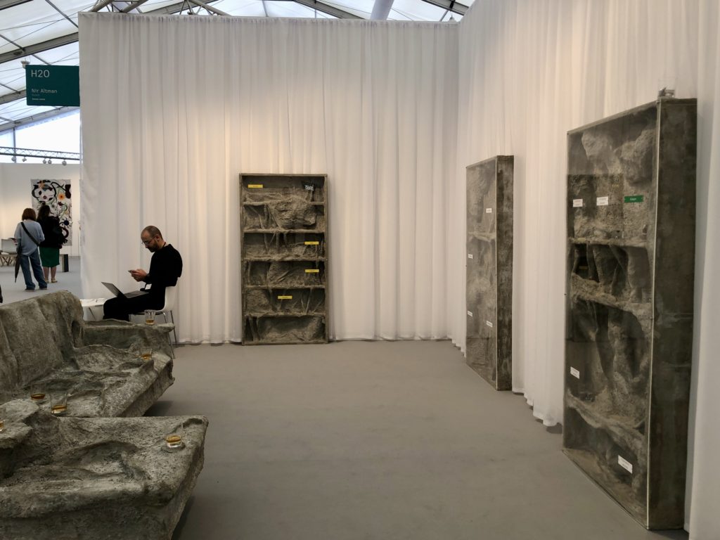
CRYSTAL: Again, I was so surprised you liked those! The conversation you had with the gallerist sounded not uninteresting, but I didn’t enjoy the work. To be brutally honest, I thought it was ugly, and not intriguingly ugly, like the James Lewis work across the aisle at Nir Altman, just boringly ugly. Even though the Lewis work was also quite ugly, materially heavy concrete and plaster like semi-excavated Pompeiian remains, I was intrigued by the inexplicable glasses of whisky dotted about and labels on perspex saying things like ‘Einkorn’ and ‘Dolly’. I chatted to the gallerist and, although he was super nice, his explanation rather turned me off the work. It made the piece feel bolted together and simplistic rather than make some sense of the disparate parts in a compelling, expansive way.
TOM: That was one of those works that suggests a complex underpinning rooted in detailed research and rigorous thinking. If those things are there then you can get on board but if they’re not then it just feels a bit half-baked. Unfortunately, the only way to know is to chat to somebody who really knows the work or read a good text about it. We should have chatted to the artist!
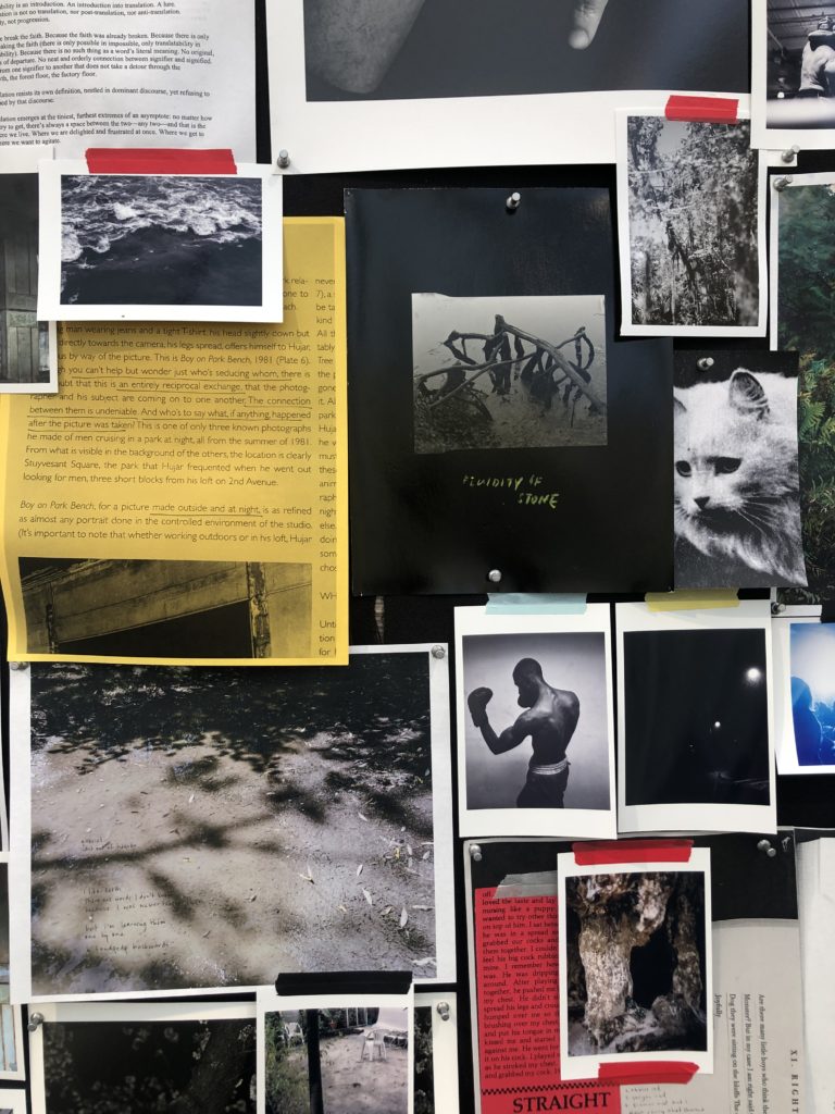
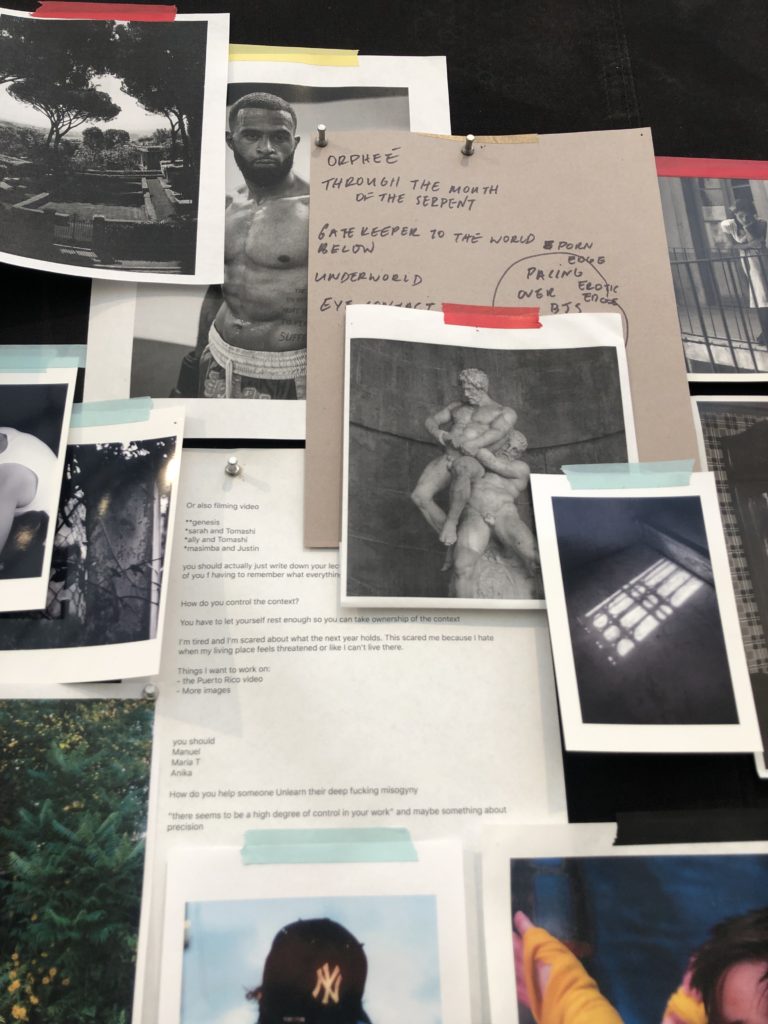
CRYSTAL: I know, it was especially stupid considering he was also standing right there! One work I also wanted to mention was Elle Pérez’s piece at 47 Canal. Pérez is a photographer, and the work is presented here as a large collage of pinned up notes, text, archive images and the artist’s own photographs in a box frame lined with sweaty, black gym mats. I like this kind of work in general—archivey, collage-based photographic work that plays with messy layouts held together by a large frame—but I think that this is a particularly good example of the type. I realise that makes me sound like a Crufts judge but whatever.
This particular assemblage plays across a variety of themes and motifs: boxing, struggle—physical and mental—embracing, vegetation, geologic landscapes, shadows. There’s a lot of black and white, punctuated by the occasional pop of colour from red, blue and yellow washi tape or from text printed on yellow paper (an underlined note about Peter Hujar’s photo Boy on Park Bench, which, rather marvellously, isn’t pinned up as part of the collage). There’s also a kind of meta framework which folds in the stresses, complexities and pressures of an artist’s existence, which I enjoyed slash related to. I like work that gives me a feeling of being allowed temporary access inside someone’s brain as they struggle to figure things out.
TOM: What about the Celine Condorelli pieces at Galeria Vera Cortes? I think we both quite liked those.
CRYSTAL: I found them intriguing initially, a bit perplexing. The gallerist explained that the works had been made as part of her recent National Gallery residency, which I found interesting as I don’t think that I’ve seen work like this by Celine before.
TOM: Yes, so it was a series of photographs of paintings in the collection, shown framed by their own storage containers. Something looked weird and then the gallerist explained that Condorelli had digitally removed the figures in order to place the emphasis on the frames, backdrops…
CRYSTAL: Support structures!
TOM: Exactly.
CRYSTAL: Again, something about the explanation rather deflated my interest in the work. I guess that’s a perennial problem with conceptual art. When you don’t fully understand what’s going on in a piece, there’s a whole host of possibilities which makes the work feel infinite or complex, but as soon as you close that down and say, well actually, it’s paintings with the portraits photoshopped out, it’s like, oh, is that all. If I had seen these in a larger solo exhibition with a lot of other work, they might have been one interesting strand in a bigger picture, but isolated in the fair context they feel thin.
TOM: One thing I did enjoy was the analogy between the pixel-by-pixel removal of a figure from a digital image and the similarly painstaking process of painting restoration. Something about those up-close modes of care that bring you very close to an object or image.
CRYSTAL: Yeah, I mean, we started to have an interesting conversation that we sometimes have about different philosophies to conservation that split along various national or regional divides, which is a subject I’m super interested in, but I’m not convinced about this particular work.
TOM: Fair enough. I think the last work we wanted to talk about was something we both liked, maybe for different reasons, and that’s José Vera Matos’s Handwritten transcription of the book Poetique de la Relation (1990) by Edouard glissant, 2023 which was on display at the Galeria Casado Santapau stand.
CRYSTAL: I was a massive nerd growing up and when I was a teenager, instead of posters of punk bands on my walls, I had a huge poster with the entirety of Romeo and Juliet typed out on a single page. You could hardly read the text, but that wasn’t really the point. Similarly, it was the pattern and intricacy of Matos’s drawing that initially attracted me from across the hall – it reminded me of that poster, but also of textiles I’d seen in Peru and Mexico. Once right up close next to the drawing, it was impossible not to be somewhat awed by the physical labour of this entire book written out by hand.
TOM: I mean, I’ve been thinking a lot lately about writing as material and embodied practice, and I think that really comes through in these works. Writing becoming drawing, text becoming landscape or pattern. For me though, the work raised a lot of questions and I want to go away and find out more about the artist’s practice. Like firstly, what does it mean for a Peruvian artist to write a text by Glissant out in full? Is it an act of reverence or appropriation?

CRYSTAL: I think it’s meaningful that Matos works mostly with anti-colonial texts. Writing out text in long hand is physically demanding, yes, but there’s also a meditative aspect where you end up repeating phrases of the text over and over again in your mind. In my experience, you internalise the text, but in a gentle way where memorization happens almost by accident. I’m intrigued by the idea that Matos has made himself into a repository for the texts with a series of artefacts that maybe commemorate the act of this kind of obsessive, ritualised reading.
TOM: Agreed, but also is there something fetishistic about this approach to handwriting (in a context of endlessly typed communications via emails, Whatsapp etc) and about the physical labour involved? One thing I also noticed was that the translator wasn’t mentioned (the text was written out in Spanish), so is there an erasure of one person’s labour involved in the foregrounding of another? And then lastly, it’s interesting because as much as this kind of writing-out-in-full might seem almost devotional the fact that nobody is going to stand and read the whole thing – what does that do to the text and your ideas about what’s important in a piece of writing? A lot of questions really – I mean, I found the work utterly fascinating. I want to know more.
CRYSTAL: I don’t know about that. I certainly read my Shakespeare poster when I had it on my bedroom wall. But maybe it’s that the aesthetic quality of the drawing is a gift for the viewer, but the devotional act of the process of making the work is for the benefit of the artist alone.
Frieze London took place between 11-15 October, 2023
* This sentence was amended on 19th October. Polly Staple was the original curator of Frieze Projects, not Sarah McCrory as Tom had initially said. Thank you to Latitudes curatorial office in Barcelona for pointing this out!
Image credits (from top), all photos Crystal Bennes unless otherwise indicated
Cover. Elle Pérez. guabancex IV, xerox paper, c-prints, inkjet prints, pins, tape, rocks, gym mat, sweat, 2023 [detail]
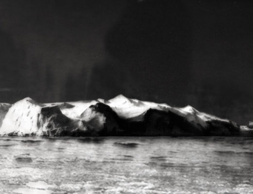
1. “Colosseum of the Consumed” by Grizedale Arts , Frieze 2012 (photo Polly Brandon)
2 & 3. Danielle Mckinney, Exodus and Reflection, oil on linen, 2023
4 & 5. Tanoa Sasraku, Pocket L, newsprint, foraged Ghanaian earth pigment, digital pigment print, tailor’s chalk, fixative spray, thread, St Ives seawater, 2023 AND detail view of Asemahle Ntlonti, Isikhumbuzo Selizwe (photos Tom Jeffreys)
6. Laurence Sturla, Deadgrounds (winter), overfired ceramic, salt and metal fixings 2023 (photo Tom Jeffreys)
7. James Lewis, Sediment, installation view, wood, steel, plaster bandage, concrete, glass, whiskey, 2023
8 & 9. Elle Pérez. guabancex IV, xerox paper, c-prints, inkjet prints, pins, tape, rocks, gym mat, sweat, 2023
10. Céline Condorelli, Pentimenti (2595), giclée print, 2023
11. José Vera Matos’s Handwritten transcription of the book Poetique de la Relation (1990) by Edouard glissant, fountain pen and ink on bamboo paper, 2023
12. Tom and Crystal look at paintings at Frieze 2023